
Focus & Navigation
All User Widgets in Unreal Engine support focus and navigation for mouse & keyboard, controller, and touch, meant to ease the user control over the UI elements.
Tip
To visualise the “navigation” border, make sure you set the Render Focus Rule in Project Settings to Navigation Only or Always. If you do not have a set widget to receive focus on Begin Play or earlier, you need to press Tab on the keyboard to force the focus on the first focusable element.
How To's
Overview
To focus on a widget, it has to be able to receive focus. Set the widget as Focusable in the Interaction section of the Details panel. If the widgets are generated, set the property using MyWidget->IsFocusable = true; or use the blueprint node, Set Is Focusable.
Once the widget receives focus, the Navigation will be handled by the rules in the Navigation tab. You can use the pre-defined rules, or create personalized functions to handle the directions where the focus can go from this widget.
In C++, the functions have the following signature to be used as Navigation rules:

Focus Path
The focus path is a stack representing the hierarchy of the focused widget (top of the stack). Widgets get removed (if any) and then added to the focus path when the user navigates around the menu. Unreal provides a few handy callbacks for widgets receiving or losing focus and path-changed events. If the widget added to the focus path doesn’t have focus, OnFocusReceived will be called after the widget is added. If the widget loses focus completely, OnFocusLost is called before OnRemovedFromFocusPath.
These are especially useful for navigating List Views -
List Views always call OnFocusReceived & OnFocusLost when the user navigates inside the container. OnFocusLost is called before OnFocusReceived if there is a previous widget on the focus path.
So, moving from ItemA to ItemB in a scroll box or list view will trigger the following callback order:
-
ItemA is removed from the focus path
-
ItemB is added to the focus path
-
ItemA loses focus
-
ItemB receives focus
On Focus Received VS On Added to Focus Path
OnFocusReceived returns a FReply in C++ (a message sent to Slate to communicate how an event was handled, if it was handled) and a FEventReply in Blueprints. OnFocusReceived gets called every time the current widget receives focus, but it will not propagate up the hierarchy tree if a child object receives focus.
Wrapping objects in layout boxes can be confusing because once the first child object of the layout has focus, the parent (layout) also receives focus, and the OnFocusReceived method is called. However, this won’t be called again on the layout for moving the focus on each child (unless forcefully called using SetFocus() ); instead, OnAdddedToFocusPath is called as the "selection" moves.
On Focus Lost VS On Removed from Focus Path
OnFocusLost() gets called when the widget has lost focus after it was removed from the Focus Path. (OnRemovedFromFocusPath() is called before OnFocusLost() ).
Tip
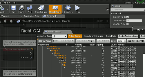
The Best way to visualise whether a widget has focus is by using the Widget Reflector from the toolbar > Window > Debug > Widget reflector. Keep an eye out for the Focus Column and the Tick that marks the focused tree. More on the Widget Reflector below!
Button Custom Hover Behaviour (common UI)
Unfortunately, moving the focus around buttons will not trigger the Hover state of the button (the pressed state works fine if you use the default press key - usually the Enter/Face Button Down key). To tackle this scenario, you can set up Custom Button Styles (FButtonStyle) and assign the hovered & regular styles when the button gets added or removed from the focus path. In the Button Style, remember to configure all the other states (Pressed, Disabled)!

Advanced List Navigation
List Entries provide handy customizations for navigation, such as marking the entries as selectable or not. A selectable entry will trigger the Selected state of the button when pressed, but it can be configured to trigger it when it receives focus. This option is useful for lists that should enable gamepad navigation.
To enable selection upon focus received on the list entry, enable these options in the List Entry Details Panel:

Navigating 2 connected lists
If both lists have entries set to Selectable upon receiving focus, and the Focus can escape from the first list (default behaviour), the user will likely be able to jump from the first list to the second one. However, the last selected item in the first list will remain selected after the focus is moved to the second list, which is undesirable.
We can force the "unfocus" of the said entry using the OnRemovedFromFocusPath callback. If the Entries are a Common UI Button Base type, you can use these protected delegates to remove the selection inside OnRemovedFromFocusPath():
OnIsSelectedChanged().Broadcast(false);
OnSelectedChangedBase.Broadcast(this, false);
Tracking Navigation
The navigation and focus can be tracked using the Navigation Simulation tool.
-
In UE4, the Navigation Simulation tab can be found under Window/Navigation Simulation.
-
In UE5, it was moved inside the Widget Reflector.
-
From the Widget Reflector window, go to Window and enable Hit Test Grid and Snapshot Widget Picker. These windows will contain information such as which widgets can receive focus, where the focus moved from the last object, and which directions are available for each navigable widget.
-

